Summary: in this tutorial, you’ll learn how to use the Flutter Column widget to arrange child widgets in a vertical array.
Introduction to the Flutter Column widget
The Column widget arranges its child widgets in a vertical array. Internally, the Column widget has two axes: main and cross.
The main axis is from top to bottom and the cross axis is from left to right:
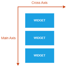
If you want to arrange widgets in a horizontal array, you use the Row widget instead.
The following example shows how to use the Column widget to arrange child widgets vertically:
import 'package:flutter/material.dart';
void main(){
runApp(const App());
}
class App extends StatelessWidget {
const App({super.key});
@override
Widget build(BuildContext context) {
return MaterialApp(
debugShowCheckedModeBanner: false,
home: Scaffold(
body: Column(
children: buildWidgets(context),
),
),
);
}
List<Widget> buildWidgets(context){
var colors = [Colors.redAccent, Colors.greenAccent, Colors.blueAccent];
return colors.map((color) => Container(
height: 50,
width: 50,
color: color,
)).toList();
}
}
Code language: Dart (dart)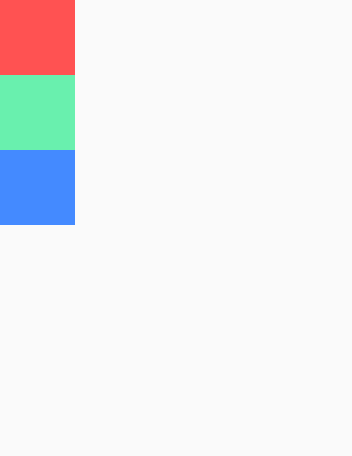
In this example, each child widget is a Container widget with the same height and width. The Column widget arranges the Container widgets vertically.
Setting the size of the main axis
By default, the Column widget takes all the vertical space.
To visualize it clearly, you can enable the debug paint feature that draws guidelines over your app. The guidelines display render boxes, alignments, padding, etc. The debug paint is very useful for understanding and fixing your layout.
To turn on the debug paint, you follow these steps:
First, import the rendering.dart from the flutter package:
import 'package:flutter/rendering.dart';Code language: JavaScript (javascript)Second, set the debugPaintSizeEnabled to True:
debugPaintSizeEnabled = true;Code language: JavaScript (javascript)For example:
import 'package:flutter/material.dart';
import 'package:flutter/rendering.dart';

void main() {
  runApp(const App());
}

class App extends StatelessWidget {
  const App({super.key});

  @override
  Widget build(BuildContext context) {
    debugPaintSizeEnabled = true;
    return MaterialApp(
      debugShowCheckedModeBanner: false,
      home: Scaffold(
        body: SafeArea(
          child: Column(
            children: buildWidgets(context),
          ),
        ),
      ),
    );
  }

  List<Widget> buildWidgets(context) {
    var colors = [Colors.redAccent, Colors.greenAccent, Colors.blueAccent];
    return colors
        .map((color) => Container(
              height: 50,
              width: 50,
              color: color,
            ))
        .toList();
  }
}
Code language: Dart (dart)
Once the Debug Paint is on, Flutter shows the guidelines of each widget of the app. In this example, you’ll see that the Column widget takes up all vertical space:
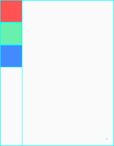
If you want to set the size of the column to the minimum, you can use the mainAxisSize property. The mainAxisSize accepts the min and max values of the MainAxisSize enum.
The mainAxisSize defaults to max, indicating that the main axis will maximize the space vertically.
The following example shows how to minimize the vertical space of the main axis:
import 'package:flutter/material.dart';
import 'package:flutter/rendering.dart';

void main(){
  runApp(const App());
}

class App extends StatelessWidget {
  const App({super.key});
  @override
  Widget build(BuildContext context) {
    debugPaintSizeEnabled = true;
    return MaterialApp(
      debugShowCheckedModeBanner: false,
      home: Scaffold(
        body: Column(
          mainAxisSize: MainAxisSize.min,
          children: buildWidgets(context),
        ),
      ),
    );
  }

  List<Widget> buildWidgets(context){
    var colors = [Colors.redAccent, Colors.greenAccent, Colors.blueAccent];
    return colors.map((color) => Container(
      height: 50,
      width: 50,
      color: color,
    )).toList();
  }
}
Code language: Dart (dart)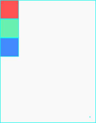
Align child widgets on the main axis
To arrange the child widgets on the main axis, you use the mainAxisAlignmentmainAxisAlignmentMainAxisAlignment enum:
startendcenterspaceBetweenspaceEvenlyspaceAround
The default value of the mainAxisAlignment is start.
start
To place the child widgets as close to the start of the main axis, you set the mainAxisAlignment to start or skip it because start is the default value.
The following example uses the start to align child widgets on the main axis:
import 'package:flutter/material.dart';

void main(){
  runApp(const App());
}

class App extends StatelessWidget {
  const App({super.key});
  @override
  Widget build(BuildContext context) {
    return MaterialApp(
      debugShowCheckedModeBanner: false,
      home: Scaffold(
        body: Column(
          mainAxisAlignment: MainAxisAlignment.start,
          children: buildWidgets(context),
        ),
      ),
    );
  }

  List<Widget> buildWidgets(context){
    var colors = [Colors.redAccent, Colors.greenAccent, Colors.blueAccent];
    return colors.map((color) => Container(
      height: 50,
      width: 50,
      color: color,
    )).toList();
  }
}
Code language: Dart (dart)
end
The end option aligns the child widgets as close to the end of the main axis:
mainAxisAlignment: MainAxisAlignment.endCode language: Dart (dart)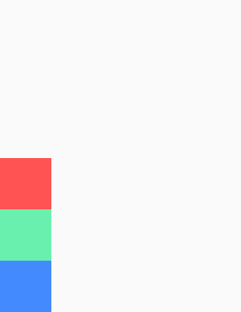
center
The center option aligns the widgets as close to the middle of the main axis:
mainAxisAlignment: MainAxisAlignment.centerCode language: Dart (dart)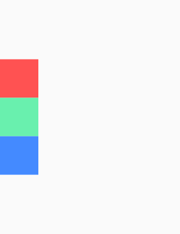
spaceBetween
To distribute the free space evenly between the child widgets on the main axis, you use the spaceBetween:
mainAxisAlignment: MainAxisAlignment.spaceBetweenCode language: Dart (dart)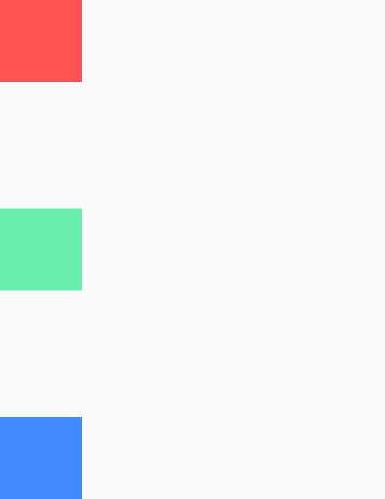
spaceAround
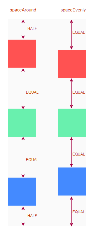
The spaceAround distributes free space evenly between the child widgets and allocates spaces evenly before the first and after the last widget.
The space before the first widget and after the last widget is half of the space between the widgets.
mainAxisAlignment: MainAxisAlignment.spaceAroundCode language: Dart (dart)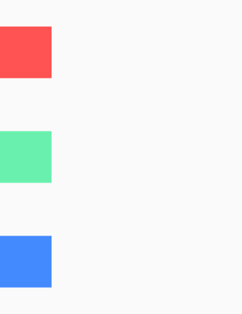
spaceEvenly
To distribute free space evenly between the child widgets and before and after the first and last widget, you use the spaceEvenly:
mainAxisAlignment: MainAxisAlignment.spaceEvenlyCode language: Dart (dart)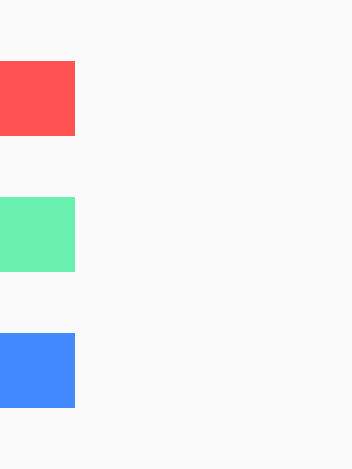
spaceAround vs. spaceEvenly
The following picture shows the difference between spaceAround and spaceEvenly:
Align children on the cross axis
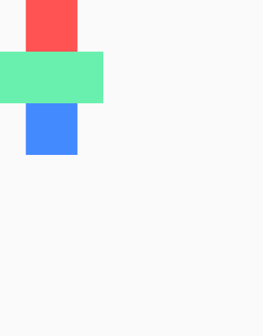
To illustrate the alignment on the cross-axis, we change the width of the second child widget from 50 to 100:
import 'package:flutter/material.dart';

void main() {
  runApp(const App());
}

class App extends StatelessWidget {
  const App({super.key});

  @override
  Widget build(BuildContext context) {
    return MaterialApp(
      debugShowCheckedModeBanner: false,
      home: Scaffold(
        body: SafeArea(
          child: Column(
            crossAxisAlignment: CrossAxisAlignment.start,
            children: buildWidgets(context),
          ),
        ),
      ),
    );
  }

  List<Widget> buildWidgets(context) {
    var colors = [
      Colors.redAccent,
      Colors.greenAccent,
      Colors.blueAccent,
    ];
    return colors
        .map((color) => Container(
              height: 50,
              width: color == Colors.greenAccent ? 100 : 50,
              color: color,
            ))
        .toList();
  }
}
Code language: Dart (dart)
By default, the Column widget aligns its child widgets in the center of the column:
To align child widgets on the cross-axis, you use the crossAxisAlignment property. The crossAxisAligment property accepts one of the values of the CrossAxisAlignment enum:
startendcenterbaselinestretch
The crossAxisAlignment defaults to center.
start
crossAxisAlignment: CrossAxisAlignment.startCode language: Dart (dart)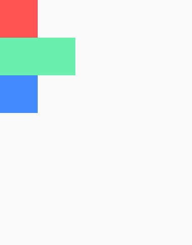
end
crossAxisAlignment: CrossAxisAlignment.endCode language: Dart (dart)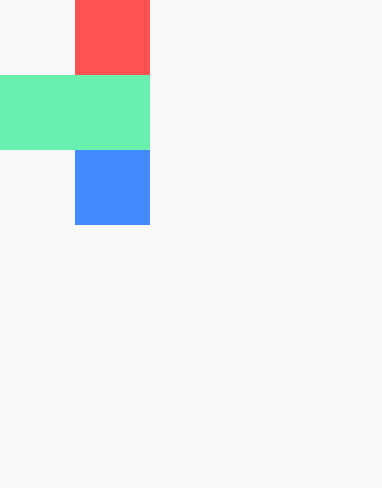
center
The center option arranges the child widgets at the center of the cross-axis:
crossAxisAlignment: CrossAxisAlignment.centerCode language: CSS (css)
stretch
crossAxisAlignment: CrossAxisAlignment.stretchCode language: Dart (dart)
baseline
When you set the crossAxisAlignment to baseline, you also need to set the textBaseline property. Otherwise, the app will crash.
The textBaseline property defines the horizontal line for aligning text and accepts one of two values of the TextBaseLine enum:
alphabetic– align the bottom of glyphs for alphabetic characters.ideographic– align ideographic characters.
The following adds a Text widget to each child widget of the Column widget and sets the crossAxisAlignment to baseline:
import 'package:flutter/material.dart';

void main() {
  runApp(const App());
}

class App extends StatelessWidget {
  const App({Key? key}) : super(key: key);

  @override
  Widget build(BuildContext context) {
    return MaterialApp(
      debugShowCheckedModeBanner: false,
      home: Scaffold(
        body: SafeArea(
          child: Column(
            crossAxisAlignment: CrossAxisAlignment.stretch,
            textBaseline: TextBaseline.alphabetic,
            children: [
              Container(
                color: Colors.redAccent,
                height: 50,
                width: 50,
                child: const Text('Dart'),
              ),
              Container(
                color: Colors.greenAccent,
                height: 50,
                width: 100,
                child: const Text('is'),
              ),
              Container(
                color: Colors.blueAccent,
                height: 50,
                width: 50,
                child: const Text('Cool'),
              ),
            ],
          ),
        ),
      ),
    );
  }
}Code language: Dart (dart)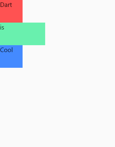
Summary
- Use the
Columnwidget to arrange child widgets in a vertical array. - Use the
mainAxisSizeproperty to set the size of the main axis. ThemainAxisSizedefault tomax. - Use the
mainAxisAlignmentproperty to align child widgets on the main axis. ThemainAxisAlignmentdefaults tostart. - Use the
crossAxisAlignmentproperty to align child widgets on the cross-axis. ThecrossAxisAlignmentdefaults tocenter. - Use the
Expandedwidget to resize the child widgets to fit the column. - Use the
flexproperty of theExpandedwidget to resize the child widget proportionally.